Every couple of weeks I add short supplements --
so check below for the highlighted add-ons.
so check below for the highlighted add-ons.
A Litany of Economic Woes
As one who writes often about the economy, and often hears gasps of bewilderment and groans of boredom, I have tried to find ways to entice readers into the subject matter. But there is no corny joke to start this essay off. A litany is a list, and 8 items should give the reader a quick oversight of the failing economy. Added is a list of 4 reforms, simple and common sense. So let’s plunge in.
1. The “average weekly earnings” of eighty percent of U.S. workers was higher in 1965, 54 years ago, than in 2019, reports the Bureau of Labor Statistics.

2. The average income for all Americans has nearly tripled since 1965, 54 years ago, states the Bureau of Economic Analysis, Department of Commerce (Table 2.1, Disposable Personal Income per capita). It was $15,052 in 1964, today it is $44,455. Economic growth of the past 54 years has improved the lives of only a minority. Between 1973 and 2007 58.7% of growth was captured by the top one percent, is the finding of a report titled “The New Gilded Age.” (page 4, pdf version)
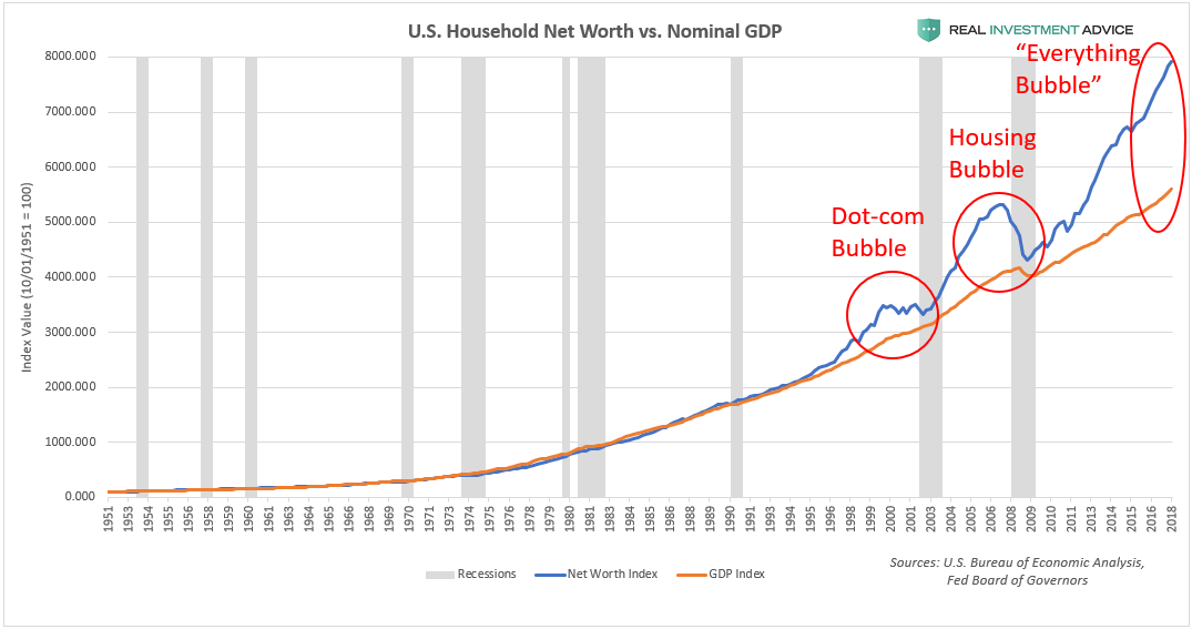
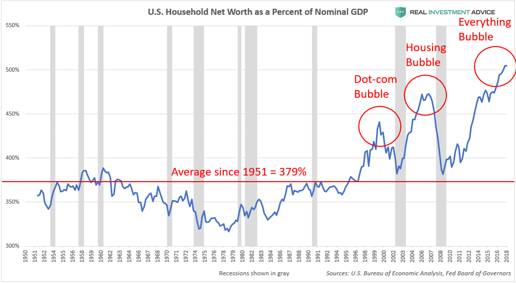
3. In the past ten years, 2009 to 2019, total private household wealth has doubled, increasing from $48 trillion to $108 trillion, states the Federal Reserves report “Flow of Funds” (page 2, and page 104). While wealth doubles, economic growth for the decade was slower than any preceding decade since 1950. While private wealth increased by nearly $60 trillion, the federal government’s expenditures were $41 trillion. Although the average savings per adult stands at $403,974, half of all adults own less than $62,000, or 15% of the average, and the lower half owns just 1.2% of all wealth. Wealth is highly concentrated, and even more than before.
4. The average savings per adult is over $400,000, but 40% of adults report they would be unable to pay a $400 emergency expense within a 30 day period, states the Federal Reserve report on Household Well Being.
5. The combined yearly wage income of half of U.S. workers, 82 million workers, amounts to less than 8% of the national income, states the Social Security Administration report on wage income. An income of less than $25,000 a year is earned by 42% of U.S. workers, and their average yearly income is $10,687.
6. The United Way charity reports, in its ALICE report, that 40% of U.S. households cannot afford seven basics of life: food, housing, utilities, transportation, phone service, health care, child care. And 40% of workers earn less than $15 an hour. The Federal Poverty Level for a family of four, $23,850 in 2014, comes to just 42% of the ALICE Basic Survival Budget for this family, $55,381.
7. Over half of U.S. workers are employed in firms employing more than 500 employees, states the Small Business Administration. A study of the use of profits of the largest 500 corporations over a ten year period shows that 93% of profits were disbursed as stock dividends or stock “buybacks”, leaving little for research or employee wage raises. In 2018 over $1 trillion of profits were used for corporate stock buybacks. If instead of spending the trillion on buybacks corporations had increased employee pay, then for 61 million workers employed in companies with over 500 employees, each worker would have received a raise of $16,300. If the 30 companies comprising the Dow Jones Index had not purchased stock but had spent the money on wage increases, then each of the eight million employees would have received $46,000 in added pay. This article is thoroughly researched; here's a quote: "Nike, Coca-Cola and Visa each could have quadrupled the pay of their median employee with the cash they sent to shareholders. Nike paid a median wage of $24,955, which is under the poverty threshold for a family of four, but spent $58,194 per worker on share repurchases and $17,004 per worker on dividends. Coca-Cola paid a median wage of $47,312 but gave shareholders $162,136 per employee."
8. In 2013 one of the authors of the U.S. Census’s Supplement Poverty Measure wrote (on page 30) that 30% of U.S. families would be characterized as not able “to meet its basic needs and achieve a safe and decent standard of living.” This is a definition of poverty.
This litany is startling and depressing. It’s a picture of a society drowning to death. What might we as a society do?
Another list, much shorter:
1. A raise of the minimum wage would affect the 69 million workers earning less than $25,000 a year.
2. Passing the Protecting the Right to Organize (PRO) Act would enable at least 61 million workers, those who labor in large corporations, to negotiate for higher pay.
3. Creating national corporate charters for the largest companies, and passing the “Reward Work Act” would require “public companies to allow workers to directly elect one-third of their company’s board of directors.”
4. Creating a large publicly funded infrastructure project, such as the Blueprint plan outlined by the Center for American Progress, would tighten the labor market, raise wages and employment, and pay living wages to all employed in it. The Green New Deal mentions the potential for this approach.
The true wealth of a nation is not money, but lies in its population, its human assets, their training, skills, and opportunities. The two reforms most needed are to 1) lower key household expenses, such as housing, medical care and child care, and 2) create a tight labor market with full employment combined with workers’ rights to bargain for higher wages. If we could achieve the income distribution ratios of the years between 1946 and 1980, then ninety percent of households would, on average, enjoy a $20,000 rise in their incomes. This benign ratio is not a new concept, it existed for about 40 years. That would eliminate poverty and re-create the broad middle class that we’ve lost.
___________________________________________________________
Notes: October 31, 2019:
Notes: October 31, 2019:
Income distribution re-visioned.
and
and
Notes: Added Graphic, November 14, 2019
____________________________________________________________________________________________________
INCOME DISTRIBUTION CLARIFIED
In the table (Table 1, page 40) from the Saez, Piketty, Zucman report we see that the lower-earning 50% receives 12.5% of all pre-tax income, and the top one percent receive 20.2%. The differential is one to 81. To grasp this more clearly, imagine that the entire national income is $400, and ask how much does each adult receive. The following is the answer.
Each of the lower 50% receives a dollar. The group from the 50th to the 90th percentile receives $4 each.
The next 9 percent, 91st to 99th percentile, receives $12 each, and the last one percent receives $81.
Distributing Income in U.S.A.
Too Unequal !
The lower half the next 40 percent the 91 to 99 group the top One percent
each earns each earns each earns One earns
one dollar four dollars 12 dollars 81 dollars
When 50 earn $1, that’s $50 12.5% to the lower half
When 40 earn $4.05, that’s $162 40.5% to percentiles 51 to 90
When 9 earn $12, that’s $108 26.8% to percentiles 91 to 99
When 1 earns $81, that’s $81 20.2% to the Top One Percent
TOTAL $401 100.0%
$ ONE to 50 $ Four to 40 $ 12 to 9 $81 to ONE
The authors write: "Today they earn 81 times more. This ratio of 1 to 81 is similar to the gap
between the average income in the United States and the average income in the world’s
poorest countries, among them the war-torn Democratic Republic of Congo, Central African Republic, and Burundi.”
ONE ——— FOUR————TWELVE————EIGHTY-ONE
for 50 for 40 for 9 for 1
X XXXX XXXXXXXXXXXX X XXXXXXXX
XXXXXXXXX
XXXXXXXXX
XXXXXXXXX
XXXXXXXXX
XXXXXXXXX
XXXXXXXXX
XXXXXXXXX
XXXXXXXXX

Sorry it's fuzzy; the best I can do. I copied it a second time for less fuzz.
I've re-ordered the income distribution table from the study by Piketty, Saez and Zucman. For 2014 they show the income percentages going to income groups; I transferred those group percentages to average income going to each group member. For instance the lowest-earning 50% of American adults in 2014 earned 12.5% of all income. If there were only 100 workers and together they earned $401 in 2014, then each of the lower-earning 50 would earn $1. It is more starkly unequal to see the
XXXs . My data comes from the Saez, Piketty, Zucman study of 2016, Distributional National Accounts, Table 1 (NBER Working Paper 22945). A companion article is Economic Growth in the United States, A Tale of Two Countries.
The authors took tax records and found out every taxpayer's income over 30 years and more.
In 1980, the lower-earning half the U.S. population had an income of $16,000, but in 2014 it had increased by 1% to $16,200. No growth.
In 1980, the lower-earning half the U.S. population had an income of $16,000, but in 2014 it had increased by 1% to $16,200. No growth.
Then the next 40 percent, from 51 to 90 percentiles, saw 40% average growth in 34 years, from an average income of $50,000 to $70,000. This group also captured 32% of all the growth in 34 years.
The top 91 to 99 percentile saw growth of 120% and they captured 32% of all growth.
The top 91 to 99 percentile saw growth of 120% and they captured 32% of all growth.
The top 1% had income growth of 210%, tripling. The one percent’s average income jumped from $425,000 to $1.3 million. They captured 36% of all growth.
I should remind readers that the study published at EPI.org, The New Gilded Age states that 58.7% of all growth went to the top one percent between 1973 and 2007, slightly different. See page 4 of the pdf version.
This "Gilded Age" report is daunting. They report on the 2015 income distribution in all 3061 counties in the U.S. In Teton County, WY, the one percent receive 59.0% of all income, and half way down, #1531, in Jefferson, Tennessee, they receive 11.7%, and at the bottom, #3061, in Valdez Cordova, Alaska, they receive 5.1%.
Now, back to the Saez, Piketty, Zucman report.
From that basic info I looked at Table 1, the first page after page 39, and I transferred 12.5% of income into average income under the hypothetical that 100 workers earned $401 that year. The average income per person in the lower 50% was 1 dollar.
The pattern in the distribution of income growth reversed itself from 1973 to 2007,
with over half (58.7 percent) of all income growth concentrated in the hands of the top
1 percent of families.
This "Gilded Age" report is daunting. They report on the 2015 income distribution in all 3061 counties in the U.S. In Teton County, WY, the one percent receive 59.0% of all income, and half way down, #1531, in Jefferson, Tennessee, they receive 11.7%, and at the bottom, #3061, in Valdez Cordova, Alaska, they receive 5.1%.
Now, back to the Saez, Piketty, Zucman report.
From that basic info I looked at Table 1, the first page after page 39, and I transferred 12.5% of income into average income under the hypothetical that 100 workers earned $401 that year. The average income per person in the lower 50% was 1 dollar.
For every one dollar earned by the lowest 50,
$1
the next 40 earned $4,
and the next 9 earned $12
and the final 1% earned $81. How do you like that?
the next 40 earned $4,
and the next 9 earned $12
and the final 1% earned $81. How do you like that?
The authors write: "Today they earn 81 times more. This ratio of 1 to 81 is similar to the gap between the average income in the United States and the average income in the world’s poorest countries, among them the war-torn Democratic Republic of Congo, Central African Republic, and Burundi.
In year 1980 the differential between the 50% and the top 1% was 27 times; the ratio tripled to 1 to 81 between 1980 and 2014.
This is pre-tax income. The post-tax income is more equal and the gaps or differentials are smaller by about half. Government social benefit transfers make a difference.
My critique of capitalism is simply that community is destroyed when income is extremely unequal. Democracy and liberal values are destroyed. I'm reading James Crotty's book "Keynes Against Capitalism", published 2019, and Crotty shows Keynes making much the same criticism.
My disenchantment also stems from the fact that so few get the real picture.
You can view a bar graph of this income distribution at my old blog, the June 2018 essay, see the third graph, the blue one from Olivier Giovannoni's study.
Another rarity not regularly reported has to do with
income share lost to the lower-earning 90% of taxpayers since 1965.

The share of income of the top 10% was below 33% between years 1943 and 1981. In 1965 the share was 31.5%, while in 2017 it was 47.9%, a shift of 16.2%. How much is 16.2% of disposable income in 2019? The BEA.gov table shows total disposable income, for Q3 2019, at $16.572 trillion.
16.2% of $16.572 trillion is $2.684 trillion. If the lower 90% had maintained its income share, then each household among the 115 million would have an
income increase averaging $23,321 -- after taxes.
Call it an increase of $27,265 before federal taxes.
Call it an increase of $27,265 before federal taxes.
The gain is incredible. Adding the $23,321 to all 90% would mean --
The average income for the
first quintile is $13,700, it would be $37,021
second quintile is $32,200, it would be $55,521
third quintile is $52,900, it would be $76,221
fourth quintile is $86,500, it would be 109,821.
This would eradicate poverty in the U.S.
And I can't do the last 10% up to the 90% percentile, as the data from the ITEP site, the table at the end of the report "Who Pays Taxes in America in 2019?" does not separate out that data.
The median income for 2018 would be not $63,179 but $86,500. Mostly the top 1% would lose income.
My previous blog, Economics Without Greed, has the same graph in the last essay, colored blue; it originated from a Levy Economic Institute report by Olivier Giovannoni, page 35, and it should be common knowledge.
This graph above included updated information to 2017 from the Top Income Data from the study "Income Inequality in the United States, 1913 to 1998". This interactive graph appears in the article "Unprecedented" published at the Economic Policy Institute, October, 2019.
The Conclusion of "The New Gilded Age" report states a similar finding:
The gains of those at the top have come at the expense of the vast majority of working families. The Economic Policy Institute’s The State of Working America, 12th Edition, found that between 1979 and 2007, had the income of the middle fifth of households grown at the same rate as overall average household income, it would have been $18,897 higher in 2007—27.0 percent higher than it actually was (Mishel et al. 2012).
Adjust that for inflation to 2019, the $18,897 becomes $24,025 -- more income to the middle fifth.
And economist James Cypher, writing in Dollars and Sense magazine in 2011, states the same conclusion,
But the actual increase today would be closer to $3 trillion, make it an increase of $26,086. That would end poverty. The question serious adults should ask, if it worked back then, 1946 to 1980, why can't we make it work now? Why? Why?
The Conclusion of "The New Gilded Age" report states a similar finding:
The gains of those at the top have come at the expense of the vast majority of working families. The Economic Policy Institute’s The State of Working America, 12th Edition, found that between 1979 and 2007, had the income of the middle fifth of households grown at the same rate as overall average household income, it would have been $18,897 higher in 2007—27.0 percent higher than it actually was (Mishel et al. 2012).
Adjust that for inflation to 2019, the $18,897 becomes $24,025 -- more income to the middle fifth.
And economist James Cypher, writing in Dollars and Sense magazine in 2011, states the same conclusion,
Nearly $2 Trillion Purloined from U.S. Workers in 2009
The lower-earning 90% of U.S. households would enjoy an income increase of $17,391 for each.But the actual increase today would be closer to $3 trillion, make it an increase of $26,086. That would end poverty. The question serious adults should ask, if it worked back then, 1946 to 1980, why can't we make it work now? Why? Why?
Added November 17, 2019 :
The ratio of income, 1 to 81, reported above is pre-tax. I became curious about the post-tax ratio and figured it out. To save readers the effort I'm just reporting the ratio, a proof would be wearisome for any reader. Below this brief paragraph I report on the wealth ratio, where the gap jumps. The pre-tax income ratio, the lower 50 to the top 1, is 1 to 81, as reported. The post-tax ratio is 1 to 40.2, meaning the social programs narrowed the differences, lowered poverty, and in general brought much assistance to low earners. Social Security is the largest program, then the Earned Income Tax Credit. The full list is in the Supplemental Poverty Measure. Poverty is reduced by more than 40%. But this is "official" poverty, and the actual hardship and poverty is between 26% and 40%. The lower-earning 50 percent, however, cannot save, and the differences in savings' amounts between the groups is a Grand Canyon gap.
The wealth ratio is 1 to 1,475. Imagine 50 people 1 inch tall and one person 130 feet tall -- same ratio.
Returning to income gaps, the post-tax gap between the lower fifty and the top one percent is reduced from 81 to 40.2.
The pre-tax gap was 81.
For every one dollar earned by the lowest 50:
The post-tax ratio in comparison:
The post-tax ratio in comparison:
Pre-tax $1 Post-tax $1
the next 40 earned $4 $2.7
and the next 9 earned $12 $6.7
and the final 1% earned $81 $40.2
_____________________________________________________________________________
Wealth per adult - Ratios
Data derived from the Credit Suisse Global Wealth Report, Databook, 2019
Total adults in U.S. 2019 = 245,140,000, page 169
Total Wealth, U.S. = $105.990 trillion, page 166
Wealth spread by deciles, page 168
Lower 50% owns 1.2% of wealth, or $1.27188 trillion.
Divided among 122.5 million adults, that’s $10,383 per adult.
Mid portion, percentiles 51 to 90, or 58,198,060 adults, owns 22.9% of wealth, or $24.27171 trillion
Divided by 58,198,060, that comes to $247,671 per adult.
The 91 to 99th percentile, 9%, or 22.05 million adults, owns 40.5% of wealth, or $42.92595 trillion.
Divided among 22.05 million adults, that’s $1,946,755 per adult.
The top 1 percent, 2.45 million adults, owns 35.4% of wealth, or $37.52046 trillion.
Divided among 2.45 million adults, that is $15,314,473 per adult.
Per adult, the lower half each owns $10,383.
The next forth percentile each owns $247,671.
The ninety-first to the ninety-ninth percentile each owns $1,946,755.
The top one percent each owns $15,314,473.
The gap between the lower 50% and the top one percent is 1,475 ———— (15,314,473 / 10,383).
As a ratio:
The lower 50 each has 1.
The next 40 each has 24.
The next 9 each has 188.
The top 1 each has 1,475.
The gap between those in the lower 50% to those in the top 1% is 1,475. ONE TO 1,475
Added information, October 13, 2019:
The Social Security Administration released its annual wage income report this month.
Median (or middle worker) wage income for over 167 million workers was $32,838. This is an increase since 2017 of 2.5% (adjusted for inflation). Not bad.
The average income per worker for the lower half was $14,320.
The collective income of this lower half of workers -- an income of $1.2 trillion for 88 plus million workers -- amounted to only 8.0% of the total national income (I added the lower total, $1,201 billion, and divided by the Joint Committee on Taxation total national income for 2018, $15,007 billion equals 8.0%). I ask myself if this is a fair wage. Wage income is very low in the U.S.A.
Really, you have to be willing to work your brain with simple arithmetic to follow my discussion in this part of the essay. How simple is 8%? for half of the workers?
This year wage income was 56% of all income. This is not unusual; the State of Working America shows for year 2011 that it was 54%. The sources of other income are indicated: capital gains, pensions, proprietors' income, cash transfers, in-kind income, and so on.
As the lower half earned 8.0% in wages, the higher half earned about 48.0% (for a total of 56%), and other income earned 44%. (8 + 48 + 44 = 100, got it?) Most of the "other income" was capital income that is destined for high earning households. Look at the State of Working America table to confirm. As my last essay at the former Economics Without Greed blogspot shows, 12.5% of all income goes to the lower-earning half of Households.
The average annual worker income for the lower half is $14,320. (You have to divide the $1.2 trillion by the 83.8 million workers) Minimum wage, $7.25 an hour for 2080 hours (one year) equals $15,080. The average for 88 million workers is $760 less, or 5% below, the yearly income of a full-time minimum wage worker. Half of the workers are earning less than a minimum wage worker who works full-time and year round. Think about it for a few seconds. What this means is that wage income is very low in the U.S. --- $7.25 an hour? That's very low income, it is poverty. How do these workers evade the "poverty" designation? They are married to a higher earning worker. Together their household rises above official poverty.
The BLS table says that the median weekly income for part-time workers in 2018 was $267 a week, or $13,884 a year. I believe this is wrong or incorrect. And another table says that 17.4% of workers are part-time. Therefore we must add 32.6% full-timers to the part-timers (17.4%) to make up the lower-earning 50%, half. Many full-timers, 32.6%, must be partial-year workers; otherwise they'd be making below minimum wage, $15,080. A part-time worker earning $15 an hour and working half time, 1,040 hours a year, would earn $15,600 in a year. The BLS numbers or the SSA numbers seem to conflict. Perhaps the partial-year workers are not accurately included. I choose and believe the accuracy of the SSA numbers; it seems incredible that the SSA would inflate the number of W-2 forms received. The error lies, probably, because the BLS does not report number of hours worked per year, and it estimates by surveys, not by actual counts. The latter also results in an underestimate of the true unemployment rate, which I think is almost 10%. See the njfac.org (monthly unemployment report) for additional arguments. And see economist Jack Rasmus discuss my analysis on his blog, here. It is too complex to burden this essay with the details, but nearly 10% of workers today are UNEMPLOYED, says I.
Eighteen years ago, in 2000, the median worker, exactly in the middle, earned, adjusting for inflation, $30,631, or $2,207 lower than in 2018; in 18 years the median has increased by 7.2%, a pitiful 0.4% per year. A look at the per capita disposable income from 2000 to 2018, at Table 2.1 BEA.gov, shows that income for all increased by 32.4% (in "chained (2012) dollars"). The economy as a whole grew 4.5 times faster than the median wage income! This is the ongoing trend since 1973. Recall a study cited above, The New Gilded Age, (see pdf version, page 4) that claims that 58.7% of all growth went to the top one percent.
Recently I calculated that the average income for the lower-half of households was $27,960, and the average for the higher half was $187,111 (30 to 180 is a difference of 6 times). The differential is 6.7 times. The higher half average is 6.7 times that of the lower half. (See the table I used the data from the ITEP.org report "Who Pays Taxes in America? 2019" , see the last table). Imagine two workers; one earns $1 and the second earns $6.70 -- that's how it goes today in the U.S.A.
It is depressing not just for lower-earning workers. It is depressing for everyone. I have friends who cannot afford dental care, and maybe you know someone who can't afford prescriptions, or can't afford rent, or child care, or a trip to their parents, or maybe a night at the restaurant. Forty percent of households cannot afford basic expenses says the ALICE report from the United Way charity -- think food, rent, utilities, car expenses, phone, medical, child care. Think about going without some of these things. Life starts to look grim, especially when this condition is continual over the years. Think about giving up your Internet connection and not being able to read this blog!
ALICE, inclusive: https://www.dropbox.com/s/rqkb78s170rr8hd/17UWALICE%20Report_NCR_12.19.17_Lowres.pdf?dl=0
It doesn't have to be this way. The average wage income for all workers is just over $50,000 (SSA report 2018), and the average income per household is over $117,000 -- AVERAGE! I think that 28% of households are single person households. Take a look at this from the USCensus, here. It says 28%. (And divide the JCT total income of $15 trillion by 128 million households. It is an average of over $117,000). The average wealth for all 250 million adults is over $400,000, see here (Databook, 2018, page 152). Imagine a nation in which all adults had an average of between $200,000 and $600,000 in savings and NET worth -- that should be us. It isn't. As you can see by looking back at my former blog, last essay citing Edward N. Wolff, or at the Credit Suisse Databook (above), both agree, the lower 40% own ZERO percent of the national savings! And 40% cannot pay an emergency expense of $400 says the Federal Reserve report on household well-being.
I try not to clutter the main text of my essays with details that just make it harder to grasp the essentials, so I put this added stuff at the end. I hope it depresses you.
Next, in 24th Place:
The United Nations produces yearly an Index of Human Development, and another index more accurately adjusted for inequality. In 2017 the U.S. scored 11th among all 189 nations before adjusting for inequality, and after it placed 24th, between Korea, Estonia, Poland, Slovakia and Isreal. (http://hdr.undp.org/en/composite/IHDI) Yet in income and GDP per capita, the U.S. ranks at the top among major nations.
The very last added comment: The graph at the top shows the movement of "average weekly earnings" for 80% of workers who are employees. Here's what I calculated: In 1973 we saw the peak wages for this 80% group, whose average yearly income (adjusting for inflation) was $47,143. It declined by 24% until 1991 and reached $35,701. These are the years of Ford, Carter, Reagan, and Bush 1. Then it picked up and now stands at $43,403, still 8% below the 1973 level. And how much has the "per capita disposable income" increased (found at BEA.gov, Table 2.1) since 1973?
Good question. In the past 46 years, per capita income increased by 122%, more than doubling. Income for 80% drops by 8%. Who says we are not the greatest? Why not share this blog with a friend? I would sleep better if you did.
______________________________________________________________
Addendum, September 9, 2019:
Steven Greenhouse, labor journalist and author of The Big Squeeze and the new book Beaten Down, Worked Up -- The Past, Present, and Future of American Labor, speaks for over an hour about his new book -- a video: see here. And Ralph Nader interviews S. Greenhouse on his Radio Hour, October 26, 2019.
_________________________
October 11, 2019 -- I recommend two articles: 1) By Sam Pizzigati at Inequality.org, "Have Researchers Just Hit an Inequality Trifecta?". Learn what a trifecta is, and learn that, "America’s 400 richest households paid taxes at a lower rate than any other income cohort in the nation, the first time that’s happened since the modern federal income tax went into effect in 1913." and that, "In 1950, Saez and Zucman point out, our top 400 households had a combined tax bill that averaged 70 percent of their incomes. A generation later, in 1980, that combined rate took 47 percent — about half — of top-400-household incomes. That rate has since fallen to last year’s 23 percent."
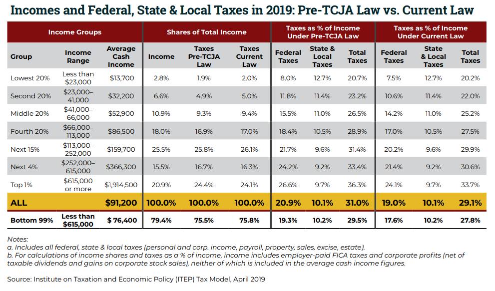
Captured by the 1%? Take a look at the report from the Institute for Taxation and Economic Policy as they critique the Tax Cut and Jobs Act, the Trump/Republican tax cut. You might conclude that the 1%, who received 58.7% of economic growth since 1973, has captured the federal government and its tax system. And a second report here -- the top 1% receive average of $50,000 in tax cuts, the lower 20% receive $90.
And the other article, 2) By Clay Marsh "Facing Deaths of Despair from the Depths of Despair in West Virginia". The first spotlights recent research and the second paints the outcome of lost opportunity resulting in lost lives. A HALF MILLION LIVES LOST IN 14 YEARS-- A quote from one reference in the article: " If the white mortality rate for ages 45−54 had held at their 1998 value, 96,000 deaths would have been avoided from 1999–2013, 7,000 in 2013 alone. If it had continued to decline at its previous (1979‒1998) rate, half a million deaths would have been avoided in the period 1999‒2013, comparable to lives lost in the US AIDS epidemic through mid-2015. Concurrent declines in self-reported health, mental health, and ability to work, increased reports of pain, and deteriorating measures of liver function all point to increasing midlife distress."
And another study referenced in the article states, "A difficult childhood reduces life expectancy by 20 years among adults who experienced six or more particular types of abuse or household dysfunction as kids, while those who suffered fewer types of trauma lost fewer years of life, a large-scale epidemiological study finds."
The conclusion states, "In other words, looking at life fearfully with a mindset of scarcity (my emphasis) physically ages people, diminishes their health, and makes them prone to drug addiction and other ills.
Alternatively, if we look at our lives as full, abundant, and safe, we can reduce stress, improve our health, and maintain our vitality.
If we can address the epidemic of hopelessness and isolation in West Virginia and across the United States, we will also address our health crises."

